15 December 2012

The Test of Time

In celebration of Raffles Hotel Singapore's 125th Anniversary Jaeger-LeCoultre was commissioned to produce 125 limited edition Reverso watches featured in a simple and elegant website.


Espaing partner

In August of this year ESPA opened Singapore's largest luxury spa and hammam at Resorts World Sentosa with co-branding, advertising, photography, art direction, styling and marketing collateral by us. Here's a selection of the work:


26 April 2012

Breaking New Ground in Baku

It was in October last year that we first shared with you some of the directions we had produced for the new Four Seasons Hotel Baku, Azerbaijan. Since then we have been busily developing over 100 collateral items; from tray removal cards to banqueting floor plan fact sheets.

Our role also involved sourcing and establishing links with a local printer within the region who were able to deliver to a high print standard. After assessing many dfferent printer calibres we eventually selected one based in Istanbul, a day or so drive from Baku. After having all the copy translated to Aseri the final artwork was sent out to production.

Colour proofs returned better than expected and it wans't too long after that the presses were running and the hotel was taking delivery well in time for their opening in June.

A very successful project where the challenges came more from working with new printers in unknown regions than developing new ideas.

Here are a selection of the items produced.


15 February 2012

Equarius Rising

The latest star to arrive in the Resorts World Sentosa portfolio of exclusive hotels, the Equarius Hotel boasts a unique tropical theme that distinguishes it spectacularly from its five star rivals.

We were appointed to rationalise and establish the brand’s identity and positioning through the creation of a powerful, memorable mark and a comprehensive brand-guide, and to further develop it through a series of brand support functions including secondary graphics system and a full complement of in-room and marketing collateral. 


Brand Identity


Photography


eDM


24 January 2012

Qube Calendar 2012

For Qube's 2012 calendar we wanted to combine the everyday with people's love of taking notes, leaving notes, jotting down, scribbling etc. The challenge was how to combine the two and still make it aesthetically pleasing and useful.


After some creative soul searching we developed a TAKE NOTE 'block' which combined 365 days with a unique set of notes on the reverse of each day. The box had two sides 'Take Note' on one side for the days and 'Noted' on the other for the note papers.

The national holidays were treated slightly differently using a more exotic stock and printing techniques including de-bossing and foil stamping.

We also included the Chinese calendar dates which was very typographically challenging.
The packaging also worked as a stand making the complete package versatile and unique.


17 October 2011

Curiouser and Curiouser

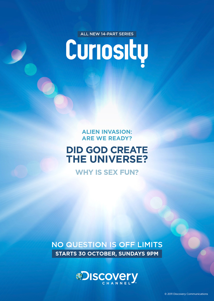
Have you ever wondered what it would be like if you could live forever? What would happen if aliens attacked? Why sex is fun? We were asked the same questions when the Discovery Network approached us to develop a new campaign for their series Curiosity.

Our challenge was to develop a series of ads and accompanying eDM that best captured our sense of curiosity, asking the most fundamental questions facing the world. Each episode focused on a single enduring question in science, technology and society. The questions were so arresting, the most challenging part for us was to evoke a positive reaction to some very direct questions.

Here are our some of our initial concept ideas:


©Jupiter Images

©Corbis

©Corbis


With sensibilities in certain regions of Asia-Pacific, a more subtle approach was required as well as delivering a more clearer message to the audience. Here are the final results: