Showing posts with label identity. Show all posts

15 December 2012

Espaing partner

In August of this year ESPA opened Singapore's largest luxury spa and hammam at Resorts World Sentosa with co-branding, advertising, photography, art direction, styling and marketing collateral by us. Here's a selection of the work:


26 April 2012

Breaking New Ground in Baku

It was in October last year that we first shared with you some of the directions we had produced for the new Four Seasons Hotel Baku, Azerbaijan. Since then we have been busily developing over 100 collateral items; from tray removal cards to banqueting floor plan fact sheets.

Our role also involved sourcing and establishing links with a local printer within the region who were able to deliver to a high print standard. After assessing many dfferent printer calibres we eventually selected one based in Istanbul, a day or so drive from Baku. After having all the copy translated to Aseri the final artwork was sent out to production.

Colour proofs returned better than expected and it wans't too long after that the presses were running and the hotel was taking delivery well in time for their opening in June.

A very successful project where the challenges came more from working with new printers in unknown regions than developing new ideas.

Here are a selection of the items produced.


17 October 2011

Old City New Luxury

Hitting the international radar as one of the world’s most ambitious and exuberant cities, Baku is the capital of the oil-rich country of Azerbaijan – located on the Caspian Sea, just north of the Middle East and bordering both Europe and Asia. Since the country regained its freedom in 1991, the Azeris have been tapping their key commodity to reclaim their history and build a bold new future.
Steps from the Old City, Four Seasons Hotel Baku boasts the capital’s most high-profile location on Neftchilar Avenue, Baku’s most prestigious boulevard.
Developing a visual identity for such a unique destination as this required a great deal of research and understanding of the culture and heritage before we could put forward any meaningful concepts. Two directions were proposed.
The first being the fusion of the old and the new, the past and the present. With a strong influence from its Turkish and Islamic roots a prominent visual identity of Baku was developed with the use of geometrical arabesque patterns.


The second direction derived itself from the Ottoman and Islamic architectural styles which meld with European influences. We drew our inspiration from the late 19th century French urban architecture used for the hotel. The line art of the exterior encapsulates the grandeur and personality of the hotel and offered numerous aesthetic representational routes.


The final part of the challenge is now in full swing, overseeing print production in Azerbaijan. Once the project is complete in late 2011 we will be sure to share with you what will be a stunning project.


13 June 2011

Jewel in the Crown

Following on from our post in December 2010 on the launch of the bespoke jewellery brand Carrie K. More recently we developed her high end brand Veritas by Carrie K. Culminating in its inaugural launch at this years fashion trade show Blueprint 2011 at Marina Bay Sands, Singapore. Veritas encapsulates the essence of the Carrie K. brand, with its distinct handcrafted, limited edition pieces our role was to bring that sense of bespoke, individuality to life in the identity and marketing collateral.

25 January 2011

A Starfish is Born

At the end of last year we were approached by a charity organisation based in Ubud, Bali. They ran a small language centre offering free English classes to Balinese children as well as paid private conversation classes in English, French and Japanese for adult members of the local Balinese community.
Devoted teachers from America, Canada and Australia joined together in support of Starfish and have been volunteering their years of education and experience to this common goal.
Their existing identity only appealed to the younger audience and with the growing number of adults, they came to us for advice and help.
Working for charities can be an exhaustive and sometimes labour intensive task, but on this occasion they were a joy to work with. Out of the several identities presented, the chosen version captured a whimsical, lighthearted feel which was inherent in their previous identity.
For more details visit their facebook fanpage.


04 January 2011

Fine Palate Packaging

Fine Palate, approached us to help them develop a new line of food packaging. Having established themselves as the leading gourmet catering company in Singapore guests soon began to inquire about their line of food items for home entertaining.

One of the chllenges for us was to deliver a concept that not only looked appealing on the grocery store shelves, but also practical for the buyer and Food Palate. This involved a great deal of research into the packaging materials from recyclability to snap freezing methods.

The creative was the easy part, here are some of the directions.


03 December 2010

Retailing Carrie K.

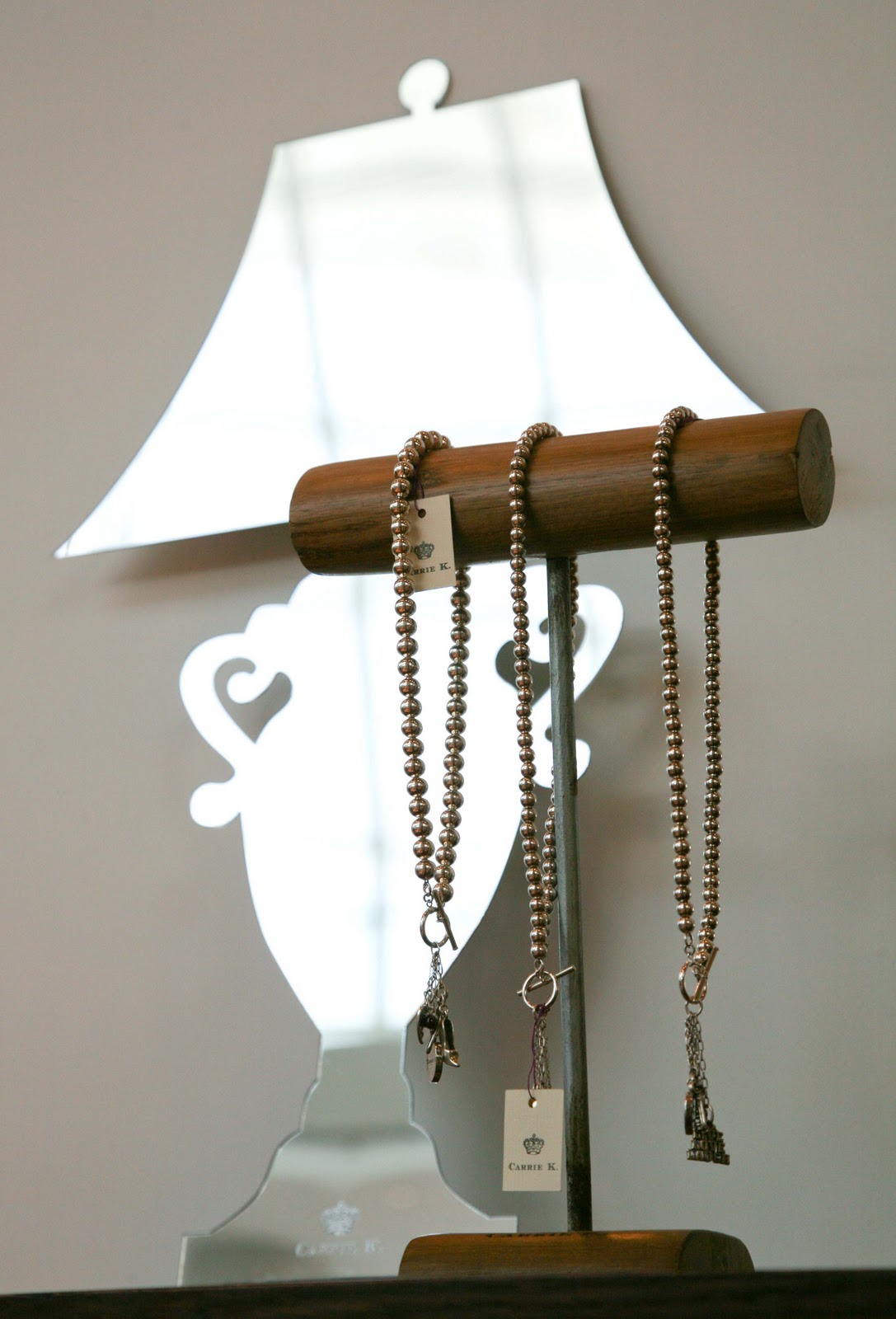
Carolyn Kan, known as Carrie to her friends, a talented up-and-coming jewelry designer based in Singapore, approached us to help with her first retail space. We jumped at the challenge to conceptualise a retail area that evoked her artisan style as well as displayed her hand made jewlery at its best.

Our first challenge was with Carrie K's existing identity. Originally produced in a small printers shop in Florence there was already some emotional attachment to the mark. Our task was to have the crown redrawn, ensuring it sat better with the type and was more robust in its applications to various mediums: email sign-offs to glass engraving. We sourced a very well known print-maker in the UK, Christopher Wormell who had just recently re-drawn the London Royal Ballet crest. His unique talent was perfect for what we needed and a real joy to work with such a talented craftsmen. Chistopher redrew the crown by hand after which he then converted the drawing to a digital format.

The second part of the challenge was to develop Carrie K's retail space which was in a modern designer fashion store, The Society of Black Sheep. A whimsical wardrobe design became the Carrie K. focal point and combined with cut-out mirrors for the jewelry, the
Carrie K. retail brand was born.

[Update: Carrie K was awarded the Best New Jewelry Designer, Elle Magazine 2010]

To see more images from the retail space visit: Carrie K on Flickr