Showing posts with label hospitality. Show all posts

15 December 2012

Espaing partner

In August of this year ESPA opened Singapore's largest luxury spa and hammam at Resorts World Sentosa with co-branding, advertising, photography, art direction, styling and marketing collateral by us. Here's a selection of the work:


26 April 2012

Breaking New Ground in Baku

It was in October last year that we first shared with you some of the directions we had produced for the new Four Seasons Hotel Baku, Azerbaijan. Since then we have been busily developing over 100 collateral items; from tray removal cards to banqueting floor plan fact sheets.

Our role also involved sourcing and establishing links with a local printer within the region who were able to deliver to a high print standard. After assessing many dfferent printer calibres we eventually selected one based in Istanbul, a day or so drive from Baku. After having all the copy translated to Aseri the final artwork was sent out to production.

Colour proofs returned better than expected and it wans't too long after that the presses were running and the hotel was taking delivery well in time for their opening in June.

A very successful project where the challenges came more from working with new printers in unknown regions than developing new ideas.

Here are a selection of the items produced.


17 October 2011

Old City New Luxury

Hitting the international radar as one of the world’s most ambitious and exuberant cities, Baku is the capital of the oil-rich country of Azerbaijan – located on the Caspian Sea, just north of the Middle East and bordering both Europe and Asia. Since the country regained its freedom in 1991, the Azeris have been tapping their key commodity to reclaim their history and build a bold new future.
Steps from the Old City, Four Seasons Hotel Baku boasts the capital’s most high-profile location on Neftchilar Avenue, Baku’s most prestigious boulevard.
Developing a visual identity for such a unique destination as this required a great deal of research and understanding of the culture and heritage before we could put forward any meaningful concepts. Two directions were proposed.
The first being the fusion of the old and the new, the past and the present. With a strong influence from its Turkish and Islamic roots a prominent visual identity of Baku was developed with the use of geometrical arabesque patterns.


The second direction derived itself from the Ottoman and Islamic architectural styles which meld with European influences. We drew our inspiration from the late 19th century French urban architecture used for the hotel. The line art of the exterior encapsulates the grandeur and personality of the hotel and offered numerous aesthetic representational routes.


The final part of the challenge is now in full swing, overseeing print production in Azerbaijan. Once the project is complete in late 2011 we will be sure to share with you what will be a stunning project.


20 January 2011

Letterpress, making an impression

There is something profoundly inspiring seeing true letterpress examples, even more so to acutally feel, touch and hold them. Maybe it is the notalgia of lead metal type, or that it evokes the very essence of design and print in its purest form, whatever it may be this dying trade has seemed to have found a resurgence in wedding collateral. Here are a couple of great examples by SMOCK based out of NY, we found them during our research for our Quentin's wedding invitation.


If you decide to go down the Letterpress route, the biggest challenge is to find a printer who can still do it. After some searching we found a printer based in Singapore who were willing to dust off their old Heidelberg and give it a try. PRENSA were very eager. Unfortunatley they did not anticipate the complications they would have rennovating their old machine, meanwhile the clock was ticking, the wedding couldn't wait. We had to go with a more conventional method of printing using debossing to achieve a similar technique. Still, next time we'll know where to go!


22 November 2010

WLB Identity, Four Seasons Hotel Hangzhou

Short for West Lake Bistro, Qube were tasked to conceptialise a comfortable, all-day dining restaurant identity serving both Asian and Western cuisine. Relaxed bright indoor interiors, twined with outdoor terraces overlooking the enchanting West Lake. Our challenge was to meld the cultural nuances of West Lake with a contemporary edge as well as incorporating a look and feel that traversed both lunch and dinner sittings.

A pewter coin was customised for the restaurant along with a unique colour palette and menu style achieving a very unique identity which stayed very true to our initial direction.


01 October 2010

Working with Four Seasons guidelines

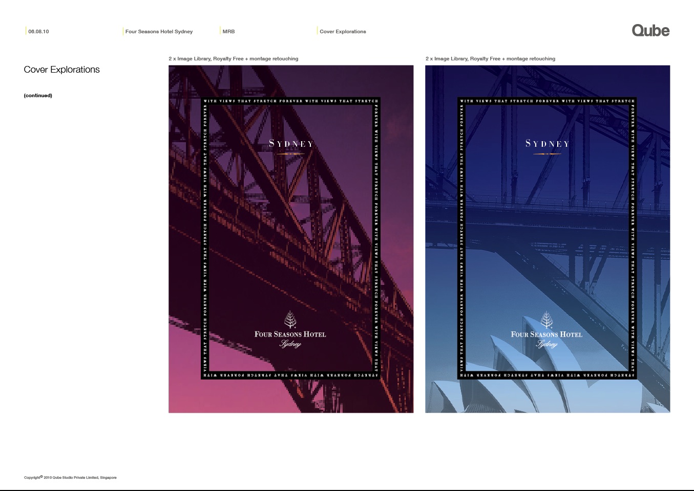
Recently Four Seasons Hotel Sydney underwent some refurbishments and as part of that development Qube were commissioned to produce a new set of marketing collateral.

Working within existing Four Seasons guidelines two distinct looks were created. (seen in the first few slides) One direction, which we particularly liked, was the 'art gallery' theme which used colourful bold graphic interpretations of the Sydney Harbour Bridge and Opera House to set the stage. The other depicted Sydney as the jewel that crowned Australia with the use of breathtaking city skylines images.

After much searching the cover image was finally sourced through the Tourism Australia Board image library who had some stunning images available for us. A unique line illustration of the Sydney Opera House 'sails' was used as a simple spot gloss varnish graphic in the final printed brochure and kit folder.

Overall, a really stunning piece which we were all very happy with.


20 September 2010

Four Seasons dynasty arrives in China

We have just completed an epic 16 month project for the soon to be opened Four Seasons Hotel Hangzhou at Westlake (October 2010).

Westlake, with its famous freshwater lake is located in the historic centre of Hangzhou, in the Zhejiang provence of Eastern China. A popular haunt since the Qing Dynasty, it was inevitable that sooner or later it would get the 5* treatment.

Our role was to capture the essence of the property and its surroundings, from its beautifully landscaped gardens to opulent dining experiences. Simplicity was the key. Lotus ponds carpeted the lake which we took as the focal point for the collateral. A series of full colour photographs of lotus flowers were applied to guest collateral, while a simpler graphic was developed for smaller items. Four restaurant identities were also developed for the properties food and beverage outlets along with their respective restaurant menus.

The challenge with these projects is always the ability to coordinate the feedback from various key decision makers around the globe as well as ensuring timelienes are met. 16 months may seem a long time but with each key change came its own set of challenges. Working alongside world renowned interior design agency Spin (http://www.ds-spin.com) also ensured we were kept on our toes without standing on any others!

A thoroughly rewarding project. Some of the samples can be seen here, or you can visit our main website to view the complete set.

Four Seasons Hotel Hangzhou at Westlake