24 January 2012

Qube Calendar 2012

For Qube's 2012 calendar we wanted to combine the everyday with people's love of taking notes, leaving notes, jotting down, scribbling etc. The challenge was how to combine the two and still make it aesthetically pleasing and useful.


After some creative soul searching we developed a TAKE NOTE 'block' which combined 365 days with a unique set of notes on the reverse of each day. The box had two sides 'Take Note' on one side for the days and 'Noted' on the other for the note papers.

The national holidays were treated slightly differently using a more exotic stock and printing techniques including de-bossing and foil stamping.

We also included the Chinese calendar dates which was very typographically challenging.
The packaging also worked as a stand making the complete package versatile and unique.


17 October 2011

Curiouser and Curiouser

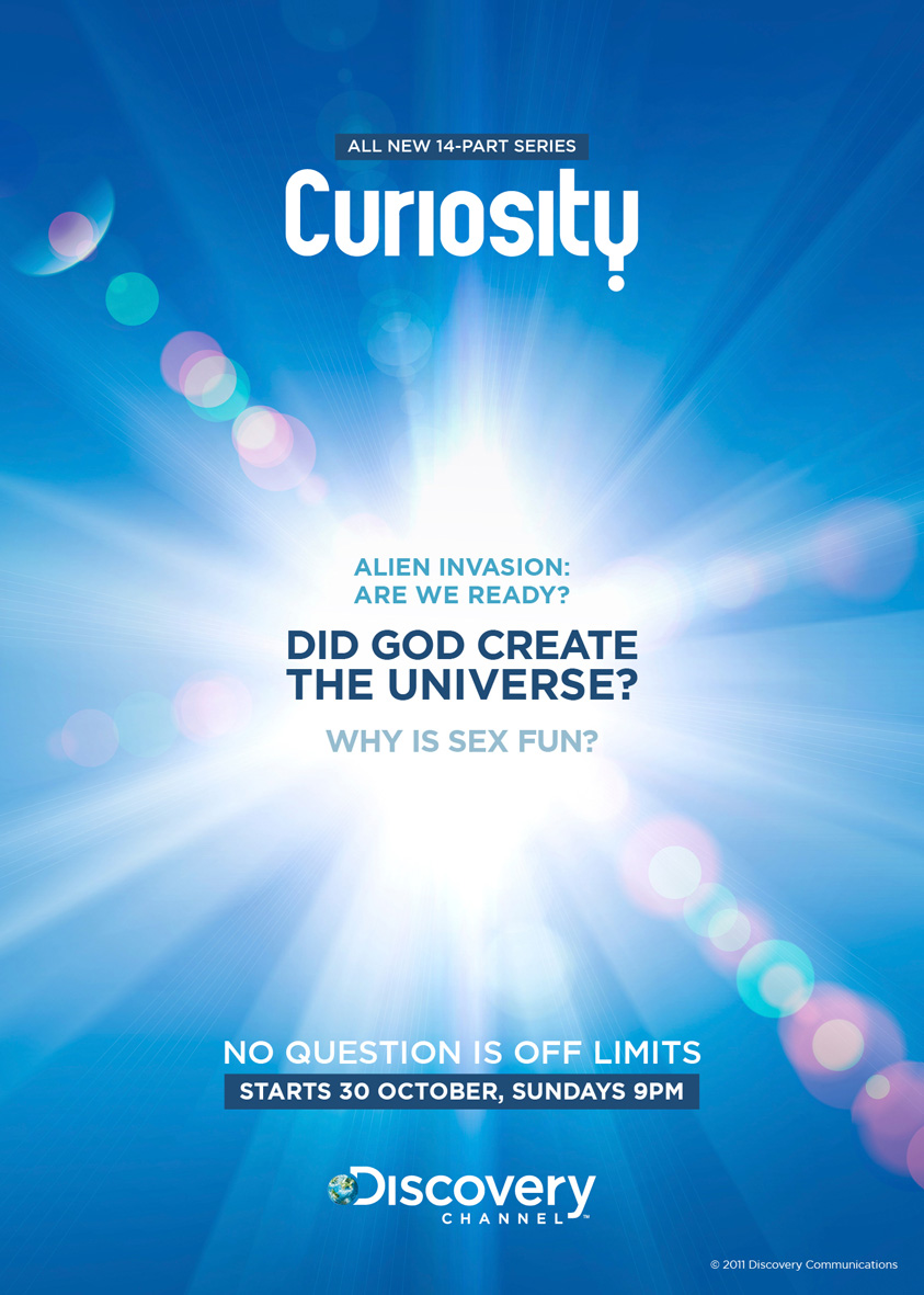
Have you ever wondered what it would be like if you could live forever? What would happen if aliens attacked? Why sex is fun? We were asked the same questions when the Discovery Network approached us to develop a new campaign for their series Curiosity.

Our challenge was to develop a series of ads and accompanying eDM that best captured our sense of curiosity, asking the most fundamental questions facing the world. Each episode focused on a single enduring question in science, technology and society. The questions were so arresting, the most challenging part for us was to evoke a positive reaction to some very direct questions.

Here are our some of our initial concept ideas:


©Jupiter Images

©Corbis

©Corbis


With sensibilities in certain regions of Asia-Pacific, a more subtle approach was required as well as delivering a more clearer message to the audience. Here are the final results:


Old City New Luxury

Hitting the international radar as one of the world’s most ambitious and exuberant cities, Baku is the capital of the oil-rich country of Azerbaijan – located on the Caspian Sea, just north of the Middle East and bordering both Europe and Asia. Since the country regained its freedom in 1991, the Azeris have been tapping their key commodity to reclaim their history and build a bold new future.
Steps from the Old City, Four Seasons Hotel Baku boasts the capital’s most high-profile location on Neftchilar Avenue, Baku’s most prestigious boulevard.
Developing a visual identity for such a unique destination as this required a great deal of research and understanding of the culture and heritage before we could put forward any meaningful concepts. Two directions were proposed.
The first being the fusion of the old and the new, the past and the present. With a strong influence from its Turkish and Islamic roots a prominent visual identity of Baku was developed with the use of geometrical arabesque patterns.


The second direction derived itself from the Ottoman and Islamic architectural styles which meld with European influences. We drew our inspiration from the late 19th century French urban architecture used for the hotel. The line art of the exterior encapsulates the grandeur and personality of the hotel and offered numerous aesthetic representational routes.


The final part of the challenge is now in full swing, overseeing print production in Azerbaijan. Once the project is complete in late 2011 we will be sure to share with you what will be a stunning project.